World Cup 2026 Kit Rankings: The 10 Worst Offenders From Qatar's Bigger Tournament
The tournament has landed and yes, it's considerably larger than before – 48 nations means you're looking at a staggering array of kit options. Strip away the goalkeepers and third kits, and you've got a proper wardrobe situation on your hands.
We're working through all 48 home shirts separately, but here's where the real kit crimes are happening – the ten most catastrophic designs from this World Cup's otherwise respectable overall collection.
10. Portugal (Home)
PUMA's effort here leans into maritime aesthetics with wave patterns supposedly evoking the sea. Fair enough, except there's nothing else going on. A genuinely promising collar design gets completely undermined by timidity – the detail sits in the same dark red as the shirt itself, with just a narrow, standard green V-neck. Reversing those colours would've transformed the collar into an actual focal point instead of this forgettable afterthought. Let's not pretend Bournemouth haven't been doing the whole "wavy shapes represent water" thing for years anyway.
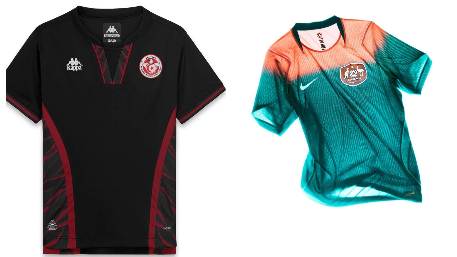
9. Tunisia (Third Kit)
Including a third kit feels harsh when many nations skip them entirely, but Kappa's approach here defies logic. The home and away shirts work beautifully together – both sporting feather detailing on the sleeves – yet this third kit abandons that coherence entirely. The collar suddenly becomes unnecessarily fiddly, giving off distinctly rugby league vibes rather than football. Then there's the head-scratching logo placement: both the Kappa Omini badge and Tunisia crest sit awkwardly right under the armpit. What's that about?
8. USA (Home)
Nike have produced some genuinely strong work this tournament, but this isn't it. The design attempts to channel 1994 – the last time the USA hosted – with horizontal stripes referencing the Stars and Stripes. The 1994 kit managed subtlety; this one does not. Those wavy vertical lines had consistency; these horizontal ones are busier and more in-your-face. Numbers on the front and back completely disrupt the design's flow. Oh, and those white stripes? They're actually off-white, giving the whole thing a distinctly grubby appearance that probably wasn't intentional. The stars apparently live on the away kit – because apparently we need the full flag treatment across the entire collection.
7. Bosnia and Herzegovina (Away)
Kelme's pattern choice creates bus-seat upholstery vibes on the home kit, but on this white away version with blue sleeves, it somehow transcends football entirely. You could genuinely picture some long-haired South American clay-court tennis specialist causing absolute chaos wearing this at Wimbledon – scandalising the members with those blue sleeves before losing a half-hearted four-set match to a British wildcard ranked 173 places lower on Court 18. It screams Commonwealth Games multi-sport competition rather than World Cup football. Genuinely looks like something table tennis players would wear. And they'll be stuck in white for two of their three group games.
6. Austria (Home)
Puma's recent tournament record is genuinely dreadful, and this is another stinker from them. Yes, they've nailed some efforts this year, so we're not swinging wildly without reason. But this is just profoundly boring – a shapeless, baggy crew neck that offers absolutely nothing. Puma slapping their logo on three different kits this tournament with apparent pride is peak hubristic behaviour from a Big Three manufacturer with such a shocking recent track record.
5. Netherlands (Home)
No. Just no. This ranks among Nike's weakest efforts, which is genuinely unforgivable given the Netherlands' natural colour advantages. The orange is fundamentally wrong. It's not dull – it's still bright – but it's the wrong kind of bright. Neon highlighter bright rather than proper orange bright. Something feels artificially off about it. Then there's the cardinal sin of centering the crest while right-aligning Nike's logo – unforgivable from a manufacturer that clearly knows this golden rule exists, given they've executed it correctly elsewhere. The iridescent badge effect doesn't help either; that's strictly away-kit behaviour.
4. Norway (Away and Third)
We despise full monochrome kits. The entire "look how edgy we are making everything one colour" approach isn't edgy – it's lazy. Even David St Hubbins called out the plain black Smell The Glove cover as a gimmick over 40 years ago, and he was right. The third kit? Identical, just in white. That's it. These should be reserved for specific occasions, not deployed as main kits. It's lazy nonsense masquerading as boldness.
3. Uruguay (Home)
Quite possibly the least football-like football shirt appearing in North America this summer – and that's a genuine crime. It's also desperately boring, with not a single standout detail. The colour is wishy-washy and the trim adds nothing. Then there are the buttons – and yes, we acknowledge this is entirely subjective, but it's our list. Buttons on football shirts feel wrong. You'd expect this at a Cambridge Boat Race trophy presentation before they chuck the shouty mascot in the Thames. The away kit, conversely, absolutely rips – so much so that we overlook our instinctive eye-twitch at a team with a blue home kit wearing a darker blue away option.
2. Czech Republic (Home)
Puma's major tournament kit record is atrocious, and this validates every criticism. It somehow manages the impossible: boring and fussy simultaneously. The red shirt is bland, yet the collar irritates – it's actually two collars fighting for attention neither deserves. The sleeve cuff detailing doesn't impress either. That button on the collar is even worse than Uruguay's effort, making everyone look like they're wearing a clip-on microphone. It's got everything wrong.
1. Australia (Away)
The worst offender. We're generally harsher on shirts doing too little than those overreaching, but Australia's away kit is something else entirely – it's desperately trying to stand out while achieving absolutely nothing. Beyond loud colours, there's genuinely nothing here. No bold print, no interesting design flourishes. Just an early-2000s gradient fade between "Bright Spruce" and "Orange Pulse" (and no, we're not remotely interested in those names because the shirt isn't remotely interesting). It's screaming "LOOK AT ME" but upon inspection, there's nothing to see. It looks less like a matchday shirt and more like a warm-up top. Embarrassing.
Compare options