England's 2026 World Cup Kit Tops Century of Tournament Shirts
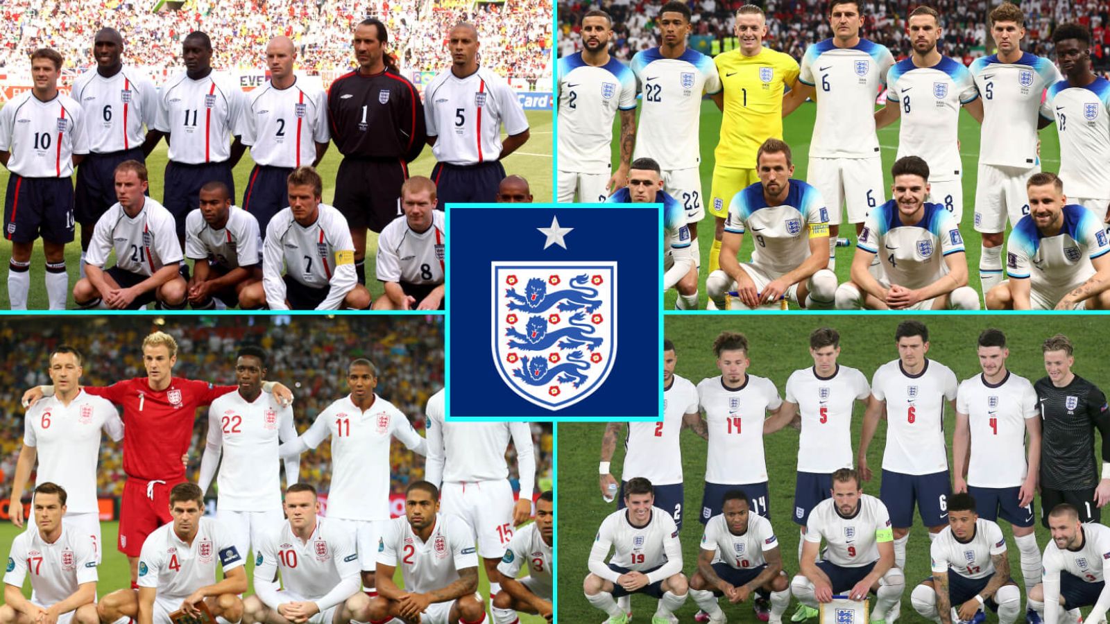
An international break means two things: a deluge of injury withdrawals and a fresh England kit demanding immediate and rigorous ranking. We last undertook this essential task in March 2024, and now the 2026 World Cup effort gives us reason to reassess our complete century-spanning hierarchy of tournament home shirts.
So where does Nike's latest offering land among England's 12 21st-century tournament kits? There is, quite literally, only one way to discover this.
The Bottom Tier
12) Euro 2016 – Those ice-blue sleeves remain an unforgivable design choice. Why Nike insisted on painting the sleeves in this peculiar shade whilst the rest of the trim stayed a darker blue defies logic. The template could have worked beautifully with proper navy sleeves, but instead we got a mess that looked even worse when players wore white baselayers underneath. Fitting that this shirt got knocked out by Iceland, when you think about it.
11) Euro 2012 – Umbro somehow managed to make the 2010 shirt even plainer whilst simultaneously even redder. The all-red badge still induces nausea. A catastrophic piece of work from a manufacturer usually capable of far better.
10) World Cup 2010 – The lazy white-polo-shirt-with-a-badge era in full effect. The Umbro crest in red rather than blue compounds the problem. Red works as an accent colour, but it needs navy as the primary supporting player. These circumstances simply didn't justify it.
9) World Cup 2022 – Those shoulders are a genuine nightmare. Far too much blue and far too many varieties of it. Nike apparently needed reminding that blue sleeves and shoulders remain forbidden territory after their 2016 disaster.
8) World Cup 2014 – Forgettable, which is arguably worse than being actively bad. The white-on-white shield doesn't quite function, and what little blue exists here lacks sufficient darkness. A genuinely unmemorable entry in the entire list.
7) World Cup 2018 – Offensively bland. The Ed Sheeran of England shirts. There is genuinely nothing worth discussing about this one.
The Respectable Middle Ground
6) World Cup 2006 – That red cross on the right shoulder forever evokes Rooney and Ronaldo and the misery of penalties. The asymmetry gambles and mostly pays off. The navy piping at the hem provides crucial balance. It's perfectly adequate.
5) Euro 2004 – A solid effort from a tournament when optimism still felt reasonable. The red-to-blue ratio might provoke debate, but this shirt demonstrates that design rules can be broken successfully when you understand the stakes. The decision to use navy for the namesets rather than red shows judicious restraint.
4) Euro 2020 – The red pinstripe on navy collar nods pleasantly towards Euro 88. The stacking of badge upon Nike logo upon shirt number looks increasingly odd the more you examine it, but everything else here proves tip-top. The colour priority sits exactly where it should.
3) World Cup 2002 – A bold and risky triumph that takes just enough of a gamble to distinguish itself whilst playing safe elsewhere. The asymmetric red stripe behind the badge succeeds handsomely, with sufficient navy trim and piping throughout to maintain acceptable colour balance. The accompanying red away kit—another absolute triumph—arguably made this the strongest overall kit package of the entire century.
The Elite
2) Euro 2024 – An instant classic that finally landed Nike in the precise sweet spot between too plain and too busy. For the first time, they produced a shirt with exactly the right amount of navy accents and an acceptable dash of red that never veers towards Bolton territory.
This kit established the definitive blueprint: enough navy to suggest a Spurs connection, enough red to prevent exactly that, but never so much red as to conjure images of Bolton. The collar gamble—neither quite full nor quite v-neck—somehow produced something genuinely handsome. Unlike too many recent England shirts, this remains unashamedly a football top rather than something designed for pub wear with jeans.
The only quibble: that white-on-white World Cup star represented unnecessary false modesty. We banged on endlessly about 1966, so why hide our solitary star?
1) World Cup 2026 – Excellent. All the elements that made Euro 2024 work remain present and correct. Nike have acted upon the feedback from two years ago, and it shows.
The proud golden World Cup star immediately justifies itself. Thomas Tuchel has spoken about achieving another, but that shouldn't prevent celebration of the one we possess. The rest of the shirt executes the established blueprint almost perfectly. You've got your navy to hint at Spurs, your red to negate that entirely, but you've successfully avoided the Bolton trap.
The collar and cuff balance the correct three colours beautifully, whilst the red-with-blue-piping side detail couldn't have been handled better. That small triangular element beneath the round collar might have annoyed us, but it doesn't.
One minor concern: that collar appears slightly baggy on even professional athletes' frames in certain photographs. Official replicas might end up looking like dodgy online fakes if this translates poorly to standard retail sizing. The away kit's more geometrically bold collar might have worked on the home shirt, though admittedly that would've represented a bigger risk.
Still, Nike have finally cracked it. After two decades of tournament kits ranging from catastrophic to merely acceptable, they've produced something genuinely worth celebrating.
Compare options